


So what’s the hot hue for twenty twenty two? Well, it’s apparently going to be a blue-tiful battle royale between Dulux’s Bright Skies (an airy blue) and Pantone’s Very Peri (a blue with violet red undertones) for Colour of the Year 2022.
Every year, the colour experts at Dulux and Pantone meticulously examine and dissect the latest global design trends to each make their own prediction for the colour that will influence everything from interiors to fashion design over the next 12 months. In fact, Dulux are such blue believers that they confidently state Bright Skies can refresh ANY room in your home.
Let’s find out why we’ll be choosing these on-trend colours for everything from our wallpaper to our wide-leg pants with low-slung waists*!
(*It’s a fashion prediction for 2022, honest.)
Dulux Colour of the Year 2022: Bright Skies
“Bright Skies is an airy and fresh tone that opens up and breathes new life into any space,” says Dulux. “It promises to open up and revitalise your home. If you want your home to be a soothing space where you can recharge and feel inspired, choose Bright Skies.”
In her interview with Good Housekeeping, Marianne Shillingford, the creative director of Dulux, continues: “A clear blue sky is beautiful and simple, melting the walls away and connecting us with the great outdoors. I always use Dulux’s Colour of the Year on my front door. Bright Skies is perfect for any space – from little alcoves, a tiny toilet or dressing room to your hall, stairs and landing. Just painting a square of this blue on a white wall gives a sense of looking at the sky.”
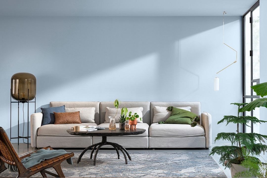
Bright Skies Living Room
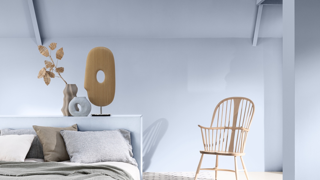
Bright Skies Bedroom
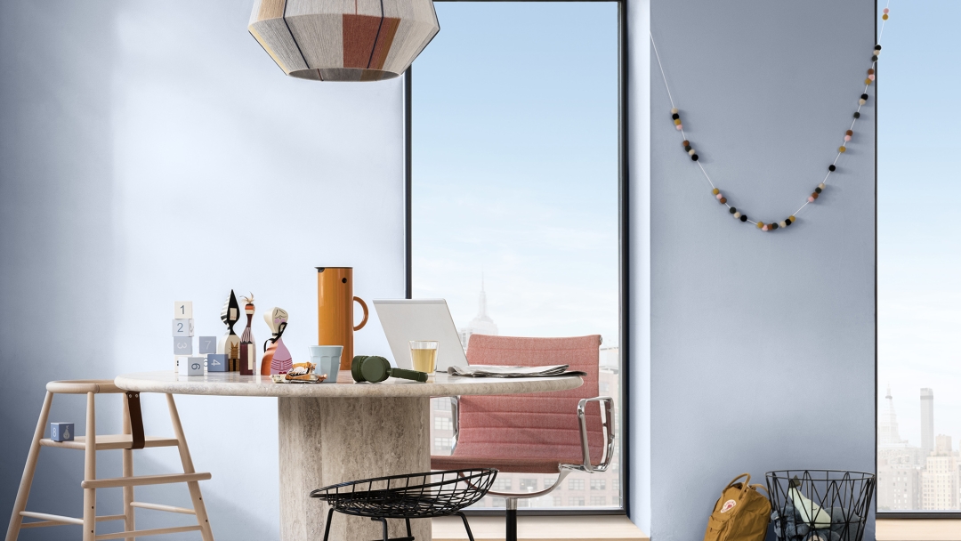
Bright Skies Dining Room
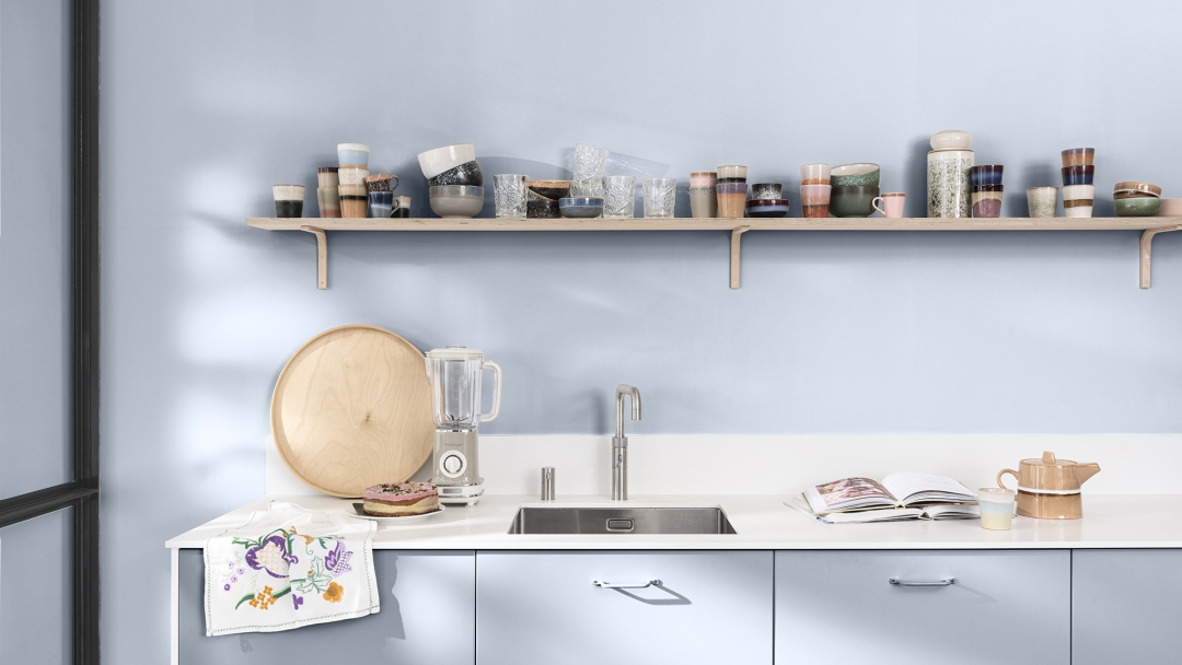
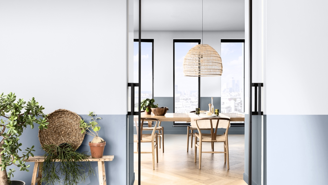
Bright Skies Kitchen
Images Source: Dulux
What Interior Design Experts Say About Bright Skies
“Nothing transforms a room like a fresh coat of paint.”
Sue Thomas at Good Housekeeping
“Bright Skies has become the next big colour to know about. The light and airy blue is a departure from the subtle green colour trends that dominated 2021. The paint shade has been designed as a breath of fresh air for your home, a shot of sky blue optimism. However, it has another clever use according to Dulux – making a small bedroom look bigger.”
Rebecca Knight at Homes & Gardens
“This is the colour of hope and optimism. In a living room, use it in spaces where you would love to have had a window or simply more light.”
Olivia Heath at House Beautiful
“Bright Skies is an airy light blue designed to feel optimistic, like a breath of fresh air in your home. The paint shade that could shape home decor colour trends in 2022, was created in response to two years of countless lockdowns confining us indoors.”
Rebecca Knight at Livingetc
“Soothing blues promote a sense of tranquility, particularly effective in relaxation spaces like bedrooms and blue bathrooms.”
Holly Phillips at Real Homes
Pantone Colour of the Year 2022: Very Peri
“Blending the faithfulness and constancy of blue with the energy and excitement of red, Very Peri is a dynamic periwinkle blue hue with a vivifying violet red undertone,” reveals Pantone. “Very Peri injects a sense of playful freshness into home interiors, enlivening a space through unusual colour combinations. It’s suited to an array of different materials, textures and finishes, providing a pop of colour, whether introduced through a painted wall, accent furniture or home decor, or acting as an intriguing and eye-catching accent in a pattern.”
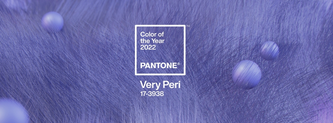
Image Source: Pantone
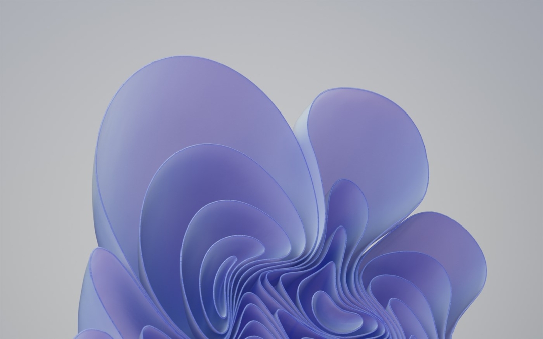
Thanks to a Pantone collaboration with Microsoft, you can even get Very Peri wallpaper on your PC.
Image Source: Microsoft
What Interior Design Experts Say About Very Peri
“This year marks the first time a colour has been created specifically for Pantone’s colour of the year designation. Additionally, Pantone has collaborated with Microsoft to bring Very Peri to its products – this includes custom Teams backgrounds, Windows wallpapers and a new Edge theme.”
Molly Long at Design Week
“Adding a rug to your floors is one of the most basic ways to make over a room. And if you’re looking to snag a new one for your space, we recommend adding a rug in tones of Very Peri.”
Nusrat Sultana at Forbes
“Pantone Color of the Year 2022 is set to reshape interior design trends instantly, but why did they choose the shade? Combining the faithfulness and constancy of blue with vivid red undertones, Veri Peri empowers you to revolutionise the familiar with something new. This is the colour that you’re going to see everywhere.”
Megan Slack at Homes & Gardens
“It’s a nice hue of blue. We can see it translating easily to our homes, as a nice accent to liven up all the neutrals, and into our wardrobes.”
Ellen Scott at Metro
“Very Peri is all about encouraging creativity. There’s something undeniably soothing about the shade, which Pantone calls the ‘happiest and warmest of all the blue hues’.”
Nick Levine at Refinery29
Style This With…
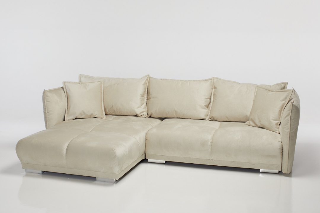
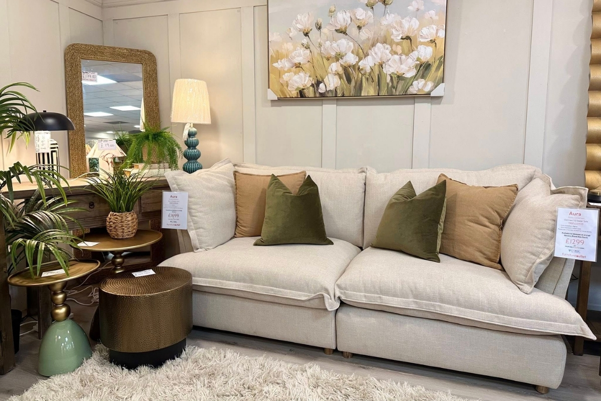
Lexington Large Reversible Sleeper Corner Chaise Sofa Bed, Ivory Velvet
As shown in the interior design examples above provided by Dulux, a cream or ivory sofa like our Lexington corner chaise sofa bed is an ideal pairing for walls, rugs and other decor using Bright Skies or Very Peri colours. Indeed, soft whites and light neutrals are immensely versatile choices for your furniture as they provide the ideal canvas for styling your living room or bedroom in a wide variety of different colours.
More Colour of the Year Blogs You May Be Interested In…
This Is Dulux Colour Of The Year 2025
Colour of the Year 2024: Sweet Embrace vs. Peach Fuzz

Leave A Comment